Friday, April 23, 2010

Book Design..


When the English version of Guatemala: Eterna Primavera, Eterna Tiranía was published in NY 22 years ago, I was living in Guatemala, and I did not pay much attention to the design. I thought designers were people who fretted about details that were not important to me or to what I wanted from a book. I was, of course, wrong.

Lucía Menéndez, who designed Guatemala: Eterna Primavera, Eterna Tiranía, spent two months shepherding the book through its various design stages. This included the photo layout, the photos' interface with the text, the sequencing and "rhythm" of the text and photos together, and delivering a camera-ready product to Print Studio last week.

Guatemala is unusual if not unique in that it contains equal parts of photo and text. Although good photos can -- and probably should -- stand on their own, Guatemala was so under-reported in the press in the 1980s that I wanted my book to be a compendium of testimonies. To that end, I devised three levels of reading: short bold-faced captions for the photo crowd; long captions for people who wanted solid information without having to slog through a lot of text; and the text for the hardcore readers.

As a result, the English version of the text was too busy: there were photos, double-spaced text and footnotes on the same page. Lucía's version of the book is a huge improvement in lots of ways.

First, Lucía gave the photos their due by blowing up the verticals to cover the page, and by running ten photos as double-page spreads. (There is a double-page of Vinicio at the beach; as Frank Goldman put it, "¡Qué pu@#$%%^ foto!" (not homage to my photography skills but to Vinicio + Speedo + gun across two pages.) She and Andrés Asturias also made photo combinations that never would have occurred to me: Mico Sandoval Alarcón, the former head of the "movement of organized violence" juxtaposed with a beleaguered civil patroller holding a torn copy of the 1985 Guatemalan Constitution, and a near-naked worker hauling sugar opposite a near naked Mardi Grass reveler at Ad Astra disco.

Second, Lucía used a cleaner typeface: Chronicle text. The captions are more compact but, at the same time, more readable than those in the U.S. version. It's clean and aesthetically pleasant.

Third, Lucía killed herself putting the book together. It is hard enough to design a photography book, but try doing a photography book where the text could be a separate tome. That was hard. I think I owe Lucía 100 beers at the Bar Central, or six months of therapy as a result. Lucía also let a whole bunch of people -- Daniel, Andrés, me -- breathe down her neck during the last part of the design process. I don't know a lot of designers, but the ones I do know keep humanity at arm's length while they work. Lucía's accommodation was unusual.

Finally, Lucía has a long-standing relationship with Print Studio, where the book was printed last week. This helped a lot, because when changes had to be made, either in the photos or the text, Lucía's relationship with PS management made a difference.

Next post: Photoshop and Andrés Asturias; Daniel Chauche at the printer

Wednesday, April 14, 2010

The Yellow Shirts


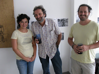
Here's a picture of me with Andrés Asturias, boy photo wonder, and Lucía Menéndez, girl design wonder, in Lucía's loft. The yellow shirt coordination was unintentional, but it does prove we all have good taste in ... color.

Wednesday, April 7, 2010


1. Daniel Chauche: http://lamiradadedanielchauche.blogspot.com

2. Estudio/A2: www.a2foto.com

3. Print Studio: http://www.manta.com/coms2/dnbcompany_8whhd4

4. National Geographic Imaging: www.ngimaging.com

I would like to acknowledge the photography component of this endeavor. In a subsequent post, I’ll note the translator’s role and the process of copyediting.

The scan of 175 Kodachrome transparencies was carried out at National Geographic Imaging in Washington, DC.

With the exception of the photo scan, however, every other aspect of the design, execution, and publication of Guatemala: Eterna Primavera, Eterna Tiranía, took place in Guatemala City.

***

In Absolutely American, author David Lipsky remarked that a book has friends before it has readers. Certainly this was true for Guatemala: Eterna Primavera, Eterna Tiranía. Below is a short description of the people who shepherded the photo process.

Anyone who lives in Guatemala knows the work of photographer Daniel Chauche, who has resided in Antigua for almost three decades. Daniel is a great photographer, but he is also an expert on book publishing. Indeed, the invisible publisher of this book is Daniel Chauche; without him this book would have been relegated to the sorry pantheon of photographic disasters that gather dust on bookstore shelves everywhere. Even as he organized his own show in El Salvador (see Website above) and another in Antigua in January, Daniel kept an eagle eye on this book’s progress. This included lining up a competent team of people in Guatemala to work the photos and put the book together. During the photo galley process at the end, when a dummy print run of the photos is printed, Daniel was indefatigable in his scrutiny of each image and his insistence on quality standards. In short, Daniel treated me photos as his own – and that is saying a lot.

Daniel introduced me to the following people:

First, Andrés Asturias. Andrés is a Photoshop genius. Estudio A2, which Andrés owns, is the place to have your photographs perfected. Andrés has state-of-the-art equipment and a team of experts in photo restoration. Just as important, Andrés is a great photographer. His photos of “Arena Negra,” literally, “Black Sand,’ which depict an unorthodox look at Holy Week in Guatemala (do not expect weeping Jesuses), is innovative and worth checking out. Andrés was also one of two Guatemalans selected for FotoEspaña 2010.

In addition, Andrés was the jack-of-all-trades with respect to seminal additions to the book: Andrés, along with Daniel, made crucial editing decisions; he inserted copyright language that a lawyer could love; and he even tightened the text.

Second, Lucía Ménendez. Andrés said that one designer he trusted to do the work reliably – Lucía Menéndez. Lucía lives in zone one, in a studio near the post office. When she undertakes a project, she lines her studio with black and white photographs of the job. Lucía is detail-driven; she belabors every last detail. I have never seen anyone devote this much effort to a book. Indeed, when I show the book to writers here in DC, the immediate query is, “Who designed this book?”

Third, Print Studio. Daniel insisted that one printer was capable of producing high-quality photo books: Print Studio in zone eight of Guatemala City. José Fahsen, the general manager, is enthusiastic about the business of printing. Even though our print run is tiny – 1,000 copies – José treated us like a corporate client because he is proud of Print Studio’s ability to deliver the goods. When the book reached the galley stage last week, when I was in Guatemala, José was at the plant during Holy Week (a miracle) to ensure quality control.

Luisa Fernanda Ruiz Lainfiesta, who was in charge of quality control, was professional and unflappable, even after a death in the family.

Next entry: Copy editing and distribution.